Advertisement
Second Time Around
Adaptive reuse is a stylish, eco-friendly reboot for urban spaces

Adaptive reuse is a creative concept in the architecture and design world. It’s all about transforming older buildings, breathing new life into them in exciting ways. Inventive, intelligent, and environmentally friendly, adaptive reuse shows us an inspiring way to rethink preservation.
Advertisement
Adaptive reuse in action
The first thing you notice when you enter design agency Burnkit’s digs in Vancouver’s Railtown neighbourhood is the stairs. The impressive design statement fashioned from ribbons of electrostatically cerulean-blue painted steel appears to be suspended in midair.
According to the architects behind the project, David Battersby and Heather Howat of BattersbyHowat Architects Inc., the central design feature in the space came about because the original concrete wall was retained. This allowed the stairs to be bolted to the wall and cantilevered, a process not possible with standard drywall.
“You experience the stairs as a piece of sculpture,” says Battersby. “We were able to do this because we looked at the potential that the concrete walls offered that you couldn’t get otherwise.”
The Burnkit renovation is an example of adaptive reuse—or finding a new purpose for an old building beyond what was originally intended. The process is not about restoring the structure as much as giving it a new lease on life. Key features are retained to give the space charm and historical relevance.
“Adaptive reuse is more than a renovation,” says Battersby. “It is a substantial transformation. It is not just a refurbishment.”
And there are significant environmental bonuses, from reducing landfill waste to fighting urban sprawl.
“If you can manage to reuse a building instead of demolish it, it is the thing to do,” says Battersby. “Sometimes, it can be more expensive to renovate, but if we truly care about the environment, we need to be cognizant of what we want while considering the implications.”
While Burnkit is a modest project for BattersbyHowat, an architecture firm known for custom modern spaces, Battersby says making eco-friendly choices is something he always encourages clients to do.
“Even in our high-end custom homes, we still look for the same efficiencies,” says Battersby. “This project was a very affirming process. Things do not need to be elaborate.”
Advertisement
Urban renewal
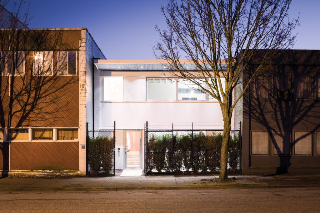
The chain-link fence in the front of Burnkit’s 2,800-square-foot Railtown property is a symbol of a neighbourhood in transition.
Because the area is still undergoing changes, the architects did minimal updates to the exterior, such as painting, replacing windows, and updating the roof overhang. Instead, the team concentrated on the interior space.
“In this particular case, it is a light industrial building in a somewhat marginalized neighbourhood,” says Battersby. “It is ultimately a space that is about utility. Our goal was to imbue it with a future and facilitate new life. The investment was in the interior, not the exterior. That can come in the future.”
Advertisement
It is all material
Sitting at a boardroom table on the second floor, Burnkit co-founder Josh Dunford points to the original ceiling joists overhead. They are vestiges of the building’s first life in the 1950s as an electrical equipment supply company. Now whitewashed and fitted with skylights scattered randomly throughout the main floor and atrium, the ceiling provides an important link to the past.
“When we purchased the building, it was rugged,” says Dunford, who adds that the building was being used as a Chinese dry goods warehouse. “The paint was peeling, the windows were broken, and pigeons were flying inside. It was an overly tired space.”
While renovating is not always less expensive than building new, in this case it was the most affordable option. “It feels good not to tear something down and throw away all the materials,” says Dunford.
Advertisement
Special details
Battersby and Howat devised a semi open-concept layout on the main floor with areas of privacy including a sunken executive office suite lightened up with the use of interior and exterior windows.
The understated construction is the perfect foil for the company’s brand identity work. Across the room, mock-ups from a beer company and fitness app paper walls of the main floor office and stand out against the spare interior.
The metal from the stair is carried across the landing and back up the wall where it is finished with a waist-high ledge. The result is a pulpit or impromptu meeting space. “There are moments of design that are really special,” says Dunford.
Simple millwork desks are arranged in groups and separated by a large, central casual gathering space, where it’s possible to have semi-private conservations or pull larger teams together.
“The materials used in the construction are simple, but considered,” says Dunford. “The space is an extension of our philosophy and approach to work.”
Transform it
Although full-scale renovation may not be on your to-do list, there are many ways to tap into the adaptive reuse trend. Look for items that once had utility and give them a new purpose with an updated look. You will be minimizing environmental impact while creating a conversation piece.
Here are some project ideas to inspire creativity:
- Repurpose an old door into a coffee table.
- Convert a steel lab table into a kitchen island.
- Update a mini trailer into a sleek sleeping space.
- Turn a cottage shed into a studio.
- Adapt a pigeon coop into a playhouse.
Plain and simple
Remodelling a warehouse into a creative studio was a budget-friendly solution that also served as a showcase for Burnkit’s minimalist brand work. This approach was carried over into the finishings. Simple materials such as plywood and concrete were used in the furniture, flooring, and walls. Then, work and trade deals were struck with major upscale clients including international light designer Bocci and furniture designer Bensen to up the design quotient.
Go green
Demolition projects generate a lot of waste. At Vancouver’s landfill, a whopping 22 percent of the waste is due to demolition alone. Experts estimate that demolition projects create roughly 20 to 30 times more waste per square metre than construction projects.
Benefits of adaptive reuse
Proponents of adaptive reuse argue that its benefits go far beyond financial savings and reduced landfill waste.
- Environmental benefits: reduced energy costs (if green materials and technologies are used)
- Social benefits: preserving the look, character, and heritage of the city and promoting the city’s livability


